Brand kit
The Harmonic Brand
Logos, colors, type and the rules for using them. Everything you need to represent Harmonic Security accurately.
Logos
The Harmonic Logo
Always lowercase. Use Racing Green on light and white on dark. Black is for one-color print only. Use the supplied files and never redraw them. Clear space equals the height of the "a" on every side, and the minimum digital size is 24 px tall.
Racing Green on light
White on dark
Black on light, one-color print

Harmonic "h" in the Pick
Download the files
Vector is the default. Use PNG where vector is not supported.
Logos (SVG)PNG logosHarmonic "h" in the Pick (SVG)Tagline lockup
The wordmark pairs with "ai security for the workforce" in two lockups, horizontal for wide spaces, headers and footers, and stacked for square and tall spaces. Use them as supplied. Never rewrite, re-space or separate the tagline from the wordmark.

Horizontal, Racing Green on light

Horizontal, white on dark
Stacked, Racing Green on light

Stacked, white on dark
Download the tagline lockups
Horizontal and stacked, in Racing Green and white. SVG and PNG with transparent backgrounds. Use Racing Green on light backgrounds and white on dark.
Tagline lockups (SVG and PNG)Color
Racing Green carries the brand, Kryptonite points
Racing Green is the primary color and Kryptonite the primary accent. Kryptonite is for dark backgrounds only. Click any swatch to copy its hex value.
Kryptonite sits outside the CMYK gamut. For swag, signage, packaging and events use the Pantone 902 C spot ink. In CMYK-only print, use white instead of Kryptonite, especially for logos.
Gradients
Gradients stay short
Emerald to Black is the default for large surfaces. The three-step gradients are thin accents only, such as rules, progress bars and underlines. Keep text on the dark end.
Backgrounds
Pattern backgrounds
Two default patterns for covers, openers and hero surfaces. Use one per section, keep text off busy areas, and never place them behind small or light copy, tables or charts. Do not recolor them.


Typography
Poppins for everything
JetBrains Mono is the secondary font, used for eyebrows and technical text. We use weight, not capitalization, for emphasis.
Pairings
Pair them like this
A 60·30·10 ratio keeps the brand calm and the lead accent loud. One accent at display size per surface.
The Band
The Harmonic Band
Four characters for storytelling, social and campaign moments. Use the supplied art as it is. Never redraw, recolor or generate the characters.
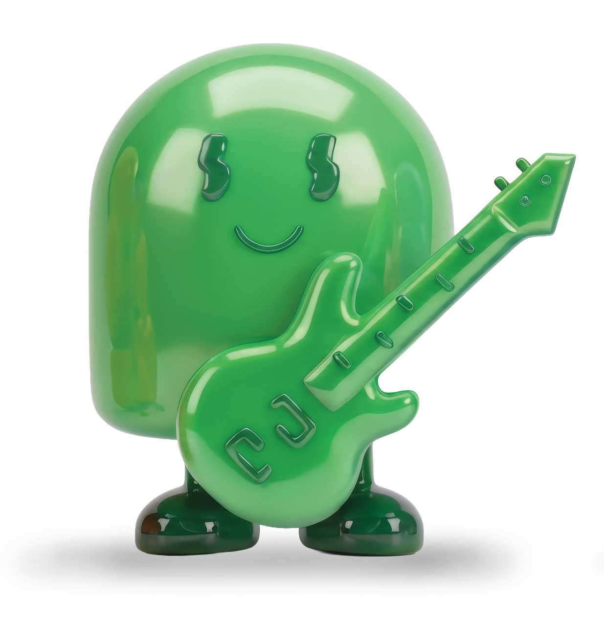 The leaderPix
The leader and the hero. Represents Harmonic and takes the shape of the dotted i in the wordmark.
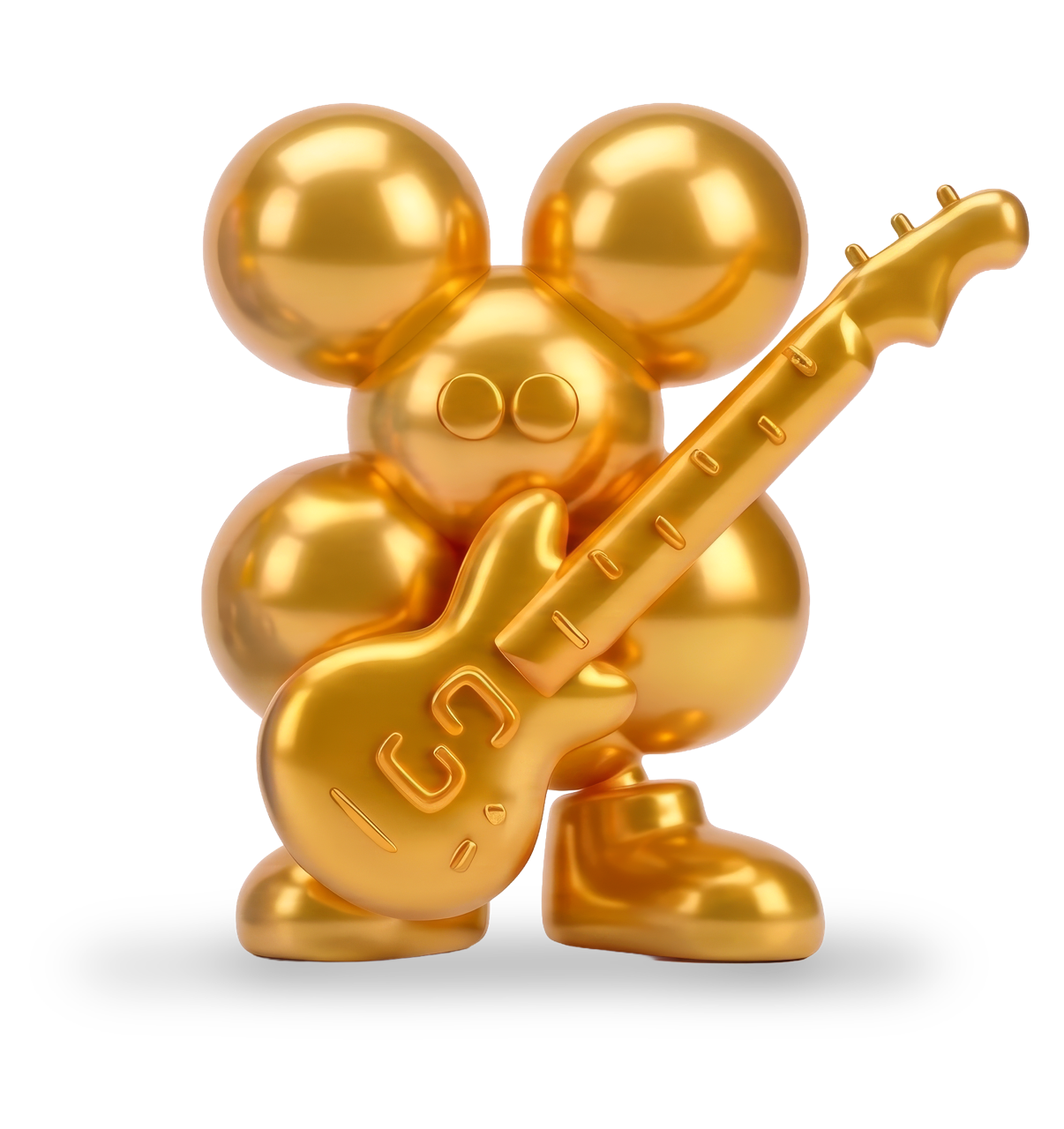 The upbeat oneCTRL
Upbeat, and knows what to do and where to be.
 The antagonistBlox
The antagonist, and the one that keeps the beat coming.
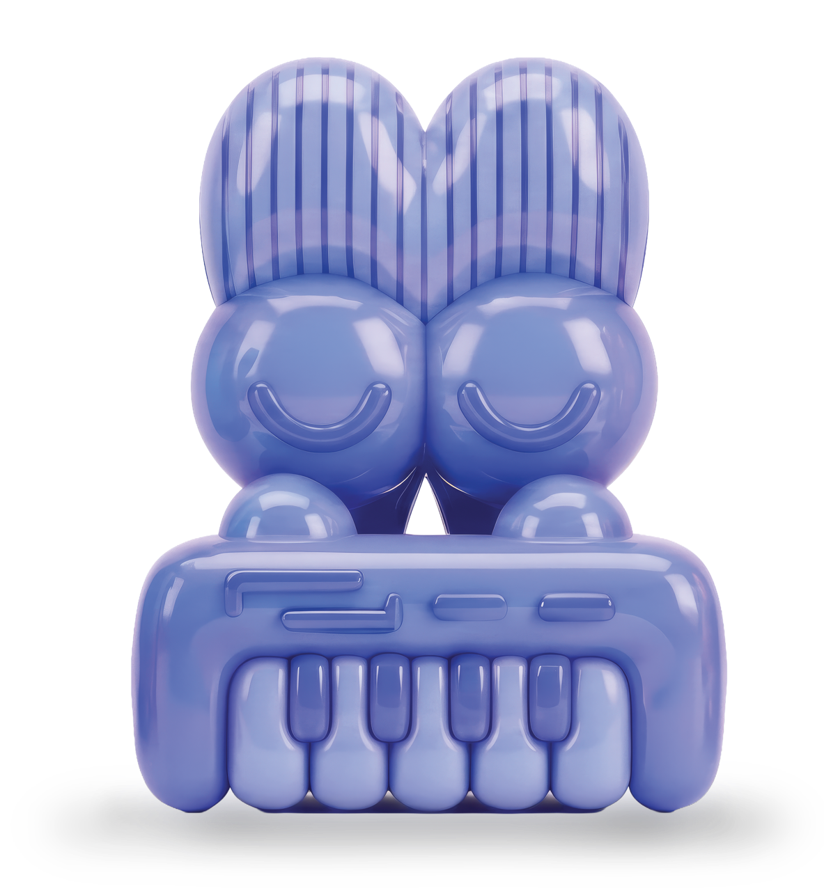 The ashamed employeeShadow
Hangs back and keeps using AI at all costs.
People
Founder headshots
For press and event use.

CEO and co-founder, Harmonic
Download headshot
CTO and co-founder, Harmonic
Download headshotRules for AI tools
Using Claude or another AI tool? Share the guide
Attach the brand guide to your request. These are the rules it will follow.
- Color. A Racing Green, White or Ashes to Ashes base, with one primary accent at display size per surface. Never Kryptonite text on white or light backgrounds.
- Logo. Use the supplied SVG. Racing Green on light, white on dark backgrounds. Never retyped, uppercased, stretched or placed on busy imagery.
- Type. Poppins for everything, JetBrains Mono for eyebrows and technical text. Emphasis by weight, not italics. Highlighted headline words change color only.
- Gradients and backgrounds. Emerald to Black for large surfaces. Three-step gradients as thin accents only, except Kryptonite to Racing Green via Emerald, which is also the website background. One background per section.
- Icons and the Pick. Bauhaus icons for concepts, one per item. The Pick brandmark is the only shape that holds the Harmonic "h", one per layout, never repeated or rotated.
- The Band. Supplied 3D or 2D art only. Never redrawn, recolored, generated or mixed across 3D and 2D.
- Writing. Plain, specific prose. No em dashes, tricolon slogans, rhetorical questions or filler like leverage, robust, seamless and unlock.
San Francisco, CA 94104
San Francisco, CA 94102
London EC1Y 8AF
