
Spotify just rolled out their 2025 Wrapped experience. Mine is an alarming blend of Kimboomers (IYKYK) and the Beatles, but we do not need to unpack that right now.
If you have been living under a rock, Spotify Wrapped is an annual breakdown of everything you listened to over the past year. We figured it would be fun to do the same with our research on GenAI usage in 2025, powered by the delightful team at Lovable. We analyzed just under 15 million prompts and mapped where they went across the AI ecosystem.
Check it out: https://genai-wrapped.com/
Slice by HQ Location or App Plans
It is always revealing to look at the types of data flowing into tools that sit outside your control. In many cases this means free plans or tools hosted in China where you lose visibility into how your data is handled.
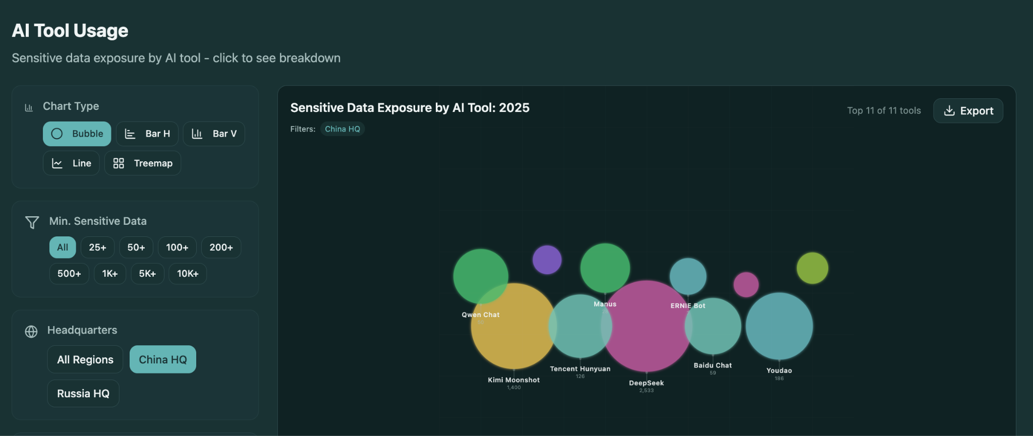
Search by AI Tool
If you want to understand usage around a specific tool or plan, you can dig into the top 25 most used apps and app tiers. This gives you a clear view of the types of sensitive data being pushed into each one.
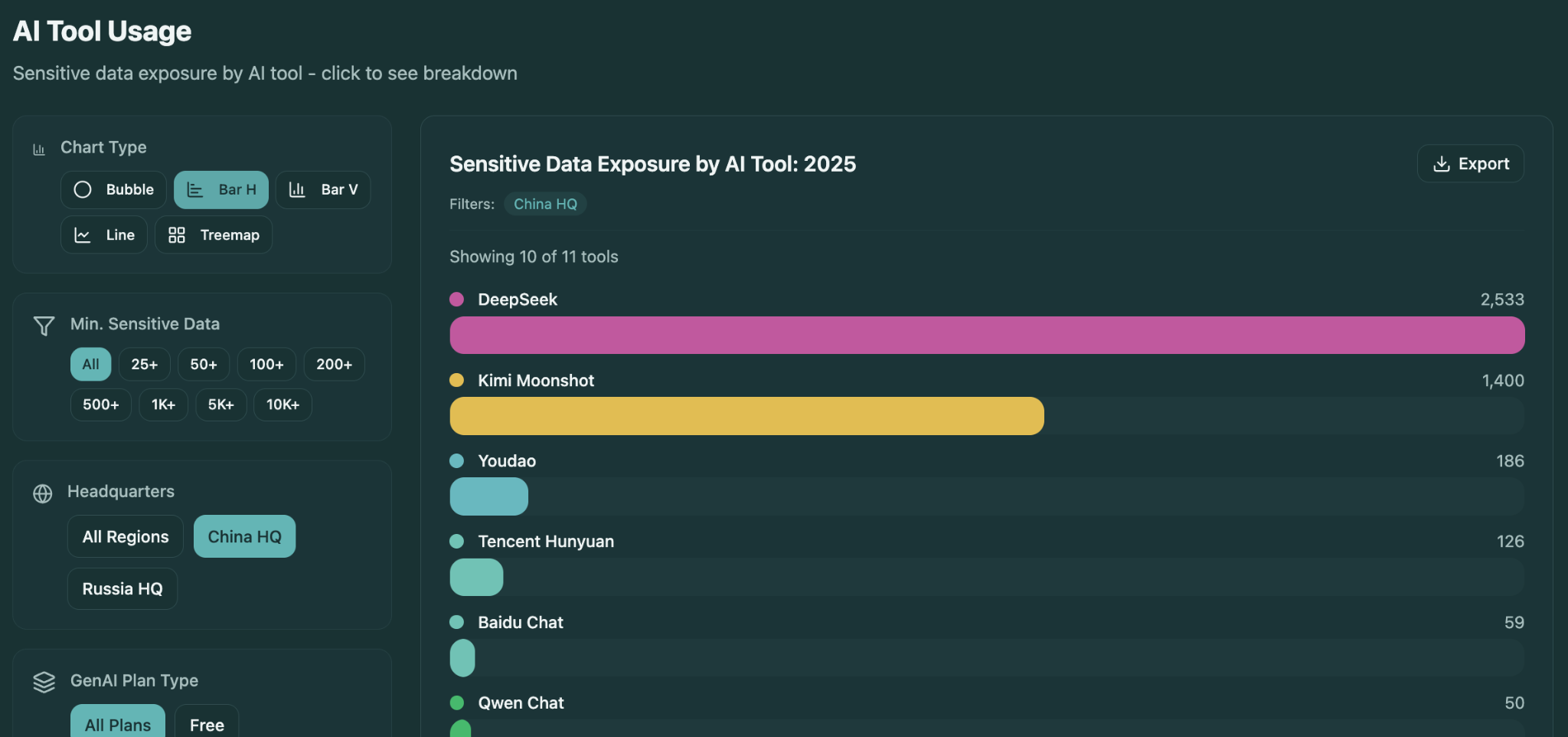
Toggle Chart Types
We added a range of visualizations including treemaps, bar charts, line charts, and bubble charts. You can build the exact chart you need to tell your story and export it easily for your own decks and presentations.
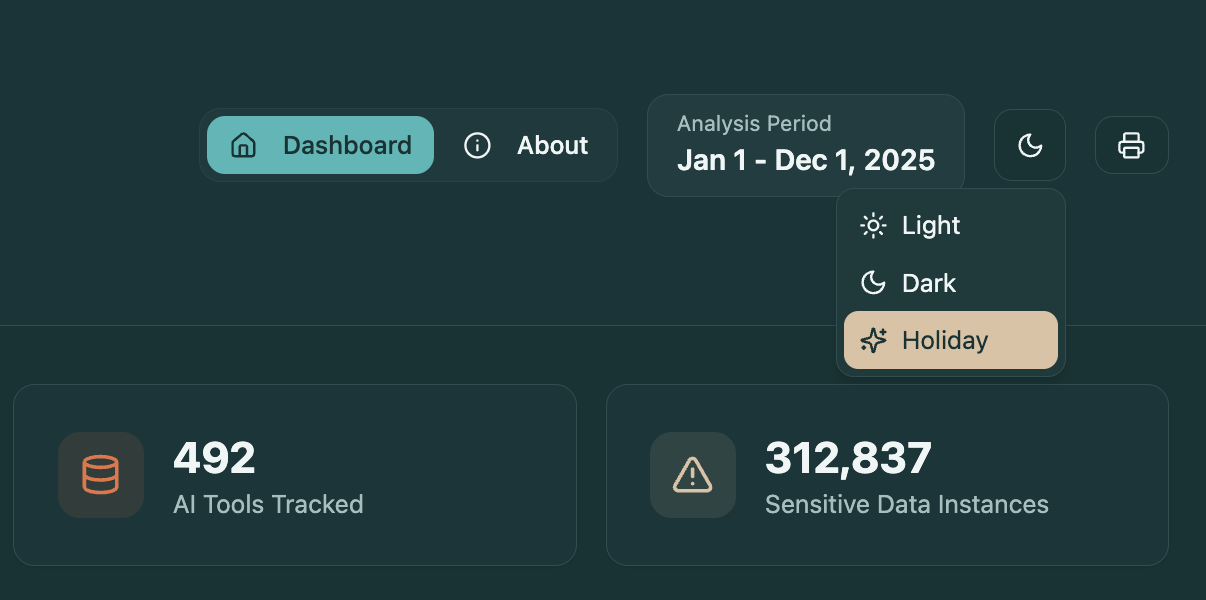
Indulge in Holiday Mode
Light and Dark mode are table stakes. For those of you who go all in on the holidays, we included something extra. Switch to Holiday mode to enjoy some unapologetically excessive animations and a collection of deeply questionable British puns.
Enjoy, and let us know if you find this useful.
.png)